There is something absolutely magical about putting color on a swath of white fabric. Color we've put on paper from the time we are old enough to hold a crayon, and some of us have put color on walls and perhaps even on furniture and other objects. But fabric rarely. If you're around my age, you might have tie-dyed some t-shirts with Rit dye back in college. And that was the extent of my dyeing experience until around ten years or so ago when my eye chanced upon an ad for
Dharma Trading Company in the back of Threads magazine. I sent for a catalog, and the rest, as they say, is history.
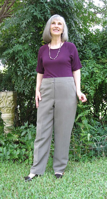
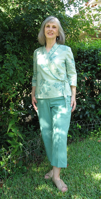
I wish I could say that I've been busily dyeing and printing fabric for those past ten years, learning and honing my skills. Alas, as much as I love it, as much as it excites me, I've only done it in spurts with too much forgetting time in between. Two years has gone by since my last venture. (You can see the two shirts I dyed/printed
here and
here.) It's actually not all that difficult, but as with any unfamiliar activity that involves both some know-how and preparation, there's always a good bit of the approach-avoidance syndrome involved, at least there is with me. But I finally got around to it, and here is the first result.
In the sweltering Texas summer, I do wear tank tops around the house, and Dharma's sturdy, non-clingy
cotton jersey is perfect. For the pattern I traced a store-bought tank: two pieces – what could be simpler? Dharma sells all sorts of clothing blanks, but I'd rather make my own because it's easier to work on a flat piece of fabric than a garment in the round. I'm planning on making several of these to try out various techniques and processes, and I like that I'm making something I can actually use rather than just experimenting on a piece of fabric.
When I first became interested in dyeing, the most useful/practical book I acquired was Erin Nobel's
Dyes and Paints which is an excellent "Hands-On Guide to Coloring Fabric" as it is subtitled. However, the book that really liberated me is Ann Johnston's
Color By Design. She sets out so clearly and simply everything you must know and do in order to...just do it! First there are assorted chemicals that you need to have and mix up, not really all that daunting. Then you mix up the dye concentrates, using
Procion MX Fiber Reactive dyes, and after that you can create colors by mixing them visually just as you would paint.
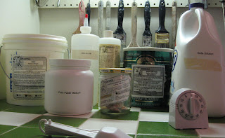 |
| The chemicals |
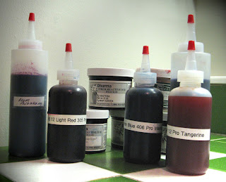 |
| The colors |
In her book, Johnston points you to single-chemical colors: basic yellows, reds and blues, plus a few others, as your color arsenal, rather than the tempting array of available pre-mixed colors. And while dyes are a bit more complicated than fabric paints, these bond chemically to the fabric, without altering its hand. They are mixed up with warm tap water, are relatively non-toxic, and can be used on all natural fibers. In the
Color By Design method, the fabric is soda-soaked prior to dye application and is "cured" by letting it sit for several hours while the chemical bond is formed. All this is probably much more than you want to know, but if you are intrigued or just curious, there is info galore on the
Dharma website, about all types of dyes, fabric paints, tools for creating surface design, as well as fabrics, yarn and clothing. As you can tell, I
love Dharma with its amusing hippie vibe.
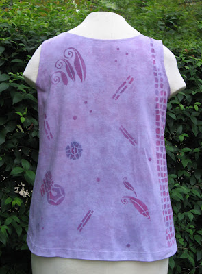
On this project my first step was to brush a color wash on the wet fabric, with the intention of having mauve at the top segue into violet at the bottom. What actually happened was that I more or less blended them together over the entire piece. (Before I began I marked my two pattern pieces on the fabric wtih stitching which would be easy to see and durable during the entire process.) Because my dye powders are older than recommended, I didn't know how much they might wash out. This photo shows them still wet.
After the base color had dried, I stenciled with print paste (made in
the chemical preparation phase) mixed with the dye concentrates. Only a
small amount is needed to color the print paste; I wanted a
blue-violet, a red-violet and a plummy shade in between the two, easy to
test by just dabbing some on a paper towel. The stencils are adapted from one of my favorite Dover books:
235 Decorative Designs of the Twenties by Henri Gillet. It's no longer in print but is available on Amazon. Once again I had no idea of how dark the designs would be when it was washed.
After the stenciling had dried, I sponged on dye mixed with more print paste to give lighter shades. As you can see, it looks very dark when freshly applied and very wet.
Finally, here is the fabric washed and ready to sew. It has lightened considerably and I've lost a lot of the blue, things I need to take into consideration when I start my next top. Which I'm hoping to do in a just a couple of days!